Big Spring Project: Exterior Paint: Some Tips from This Old House
I read a great article over on This Old House about choosing exterior paint colors, and I found their very first point really inspiring:
Start with Stone:
Exterior paint schemes should be based on colors that are already established.
So what is established at our home? First, we have a really beautiful fieldstone foundation. Perhaps we're guilty of a little parental pride, but I really do think it's exceptional.


Also, though we haven't seen it yet, we have tree that has a maroon leaves. I'm guessing it's some sort of Red Maple. And just so you know, I'm not blessed with gardening/arbor skills-- Just ask my dad. I googled it :) You can see it on the far left side of this picture:

 Which leads me to believe that the people who painted this house in its current color palette must have been drinking the same tea that I'm drinking here....
Start with Stone:
Exterior paint schemes should be based on colors that are already established.
So what is established at our home? First, we have a really beautiful fieldstone foundation. Perhaps we're guilty of a little parental pride, but I really do think it's exceptional.

Now based on our Victorian Color Palette from yesterday, here are some colors that I chose with that in mind:


Also, though we haven't seen it yet, we have tree that has a maroon leaves. I'm guessing it's some sort of Red Maple. And just so you know, I'm not blessed with gardening/arbor skills-- Just ask my dad. I googled it :) You can see it on the far left side of this picture:

 Which leads me to believe that the people who painted this house in its current color palette must have been drinking the same tea that I'm drinking here....
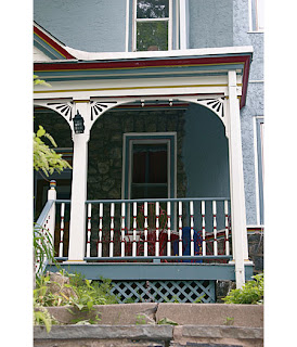
 Looking at the picture above (from the Realtor's listing) it's remarkable how organic our house looks in the Spring and summer. You can see the Red Maple reflected in the Mauve/Burgundy shutters-- see that pink flowering shrub across the street to the right? Right there in our siding-- that pink is also picked up in the Fieldstone. So what to do?
If you take these three, drawn from our palettes above, and based on the natural surroundings of our house, then you get something that basically reflects our current color palette, which heretofore we had decided was simply unpalatable:
The blue is mainly in the Gingerbread work and painted under the extended eaves. You can't see it very much in the photos above, but it is a secondary accent color.
Now, granted, the Beige is more Beige and less Pink, and the Dark Red is Dark Red and not Mauve. So here is an option which I really really like, and which (surprisingly) keeps our basic paint scheme, but updates it a little bit- or authenticates it (according to Sherwin Williams, anyway :)
Tomorrow: Some more color palette finalists.


OK, first of all, LOVE This Old House. Second, the new colors I think are perfect. At least it won't look like a 5 yr old ballerina in a crazy tutu.
ReplyDelete